
Tips: Thinking About Interior Color
Beyond Beige: Tips for Enlivening Your Living Spaces with Color
Ready to make a shift in your home’s wall color palette? Whether changing one room or the entire interior, I find these tips useful tools when beginning the color conversation with my clients. They help clarify their vision and facilitate a productive selection process, finishing with successful results that “spark joy”.
Painting your walls is the least expensive and most impactful way to update and refresh the spaces you live with everyday.
 -How could color support the purpose of the room?
– Consider the relationships of wall colors to other elements in the room (flooring, trim, furniture, area rugs, light sources, etc.) as well as to other spaces in your home.
– Allow the things you love to inspire your color choices. Take a look at your closet, favorite pillow or art. Gather examples from magazines (or create an ideabook on Houzz.com) of rooms and styles that appeal to you. A pattern of your personal color preferences will emerge.
– Look out your window; the rich spectrum of neutrals found in nature- rocks,  grasses, sky and water can be invited indoors, inspiring wall color, fabric, finishes and furnishings.
-Color tolerance: Ask yourself, do you prefer a mostly neutral palette, bringing color into the rooms with furnishings, art and accessories, or do you prefer your color on the walls? Or somewhere in between with accent walls?
– Beware of relying too much on trends.
 – Always live a few days with larger paint samples to see how the colors behave with different lighting and furniture before committing.
– Give yourself the time needed to let the color choice process evolve. Get it right the first time. You’ll enjoy it everyday.
– Take a chance. Kick it up. Be willing to step a little out of your comfort zone.
– Paint colors don’t have to “match” exactly (furniture, fabrics, etc.), they just have to “go”, i.e. coordinate.
– Reassess lighting. Inadequate illumination makes any room feel dull and dark, regardless of the wall color.
– Be ready for “the shock of the new”. The fresh wall color can be startling at first, especially without the furniture and accessories that will bring balance, proportion. Be patient.
– Use the best quality paint, painters and tools possible. Saves time, money and stress in the long run.
– Go green. Support your health and the planet by choosing low- or zero-VOC (volatile organic compounds) paints.
Common Color Misconceptions
 – Bringing color into a room will make it too bright, garish.
The hue actually isn’t as important as getting the ‘chroma” or intensity (brightness or dullness) dialed in right.
– Dark colors always make a room feel smaller, claustrophobic.
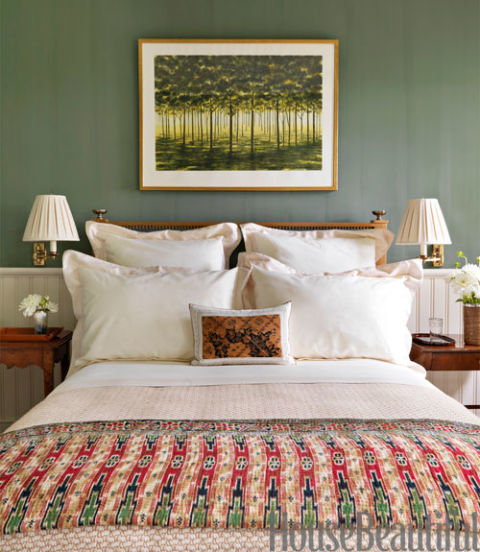
More deeply valued (mid to dark) tones can bring such warm richness and depth, drama to a room, especially with appropriate lighting. Interest adds energy, making the space feel expansive.
– Lighter colors are always better than deeper tones, especially in dark spaces. They go with more.
Lighter shades can often look pasty or “washed out” in context with furnishings, etc. Especially with poor lighting.
Deep, neutral gray is balanced beautifully with crisp whites, and a dash of soft, spicy orange for warmth.
–“Neutral” means beige, or white.
There are so many beautiful neutrals to choose from. Notice the array of
natural hues in pebbles on a riverbank.
– Beige or white is best for enhancing art.
Deeper toned wall color often set off artwork, especially more lightly framed
and matted pieces, which can get lost on white or beige backgrounds.
– The color you see on the small chip will look the same on your big wall.
Keep in mind that colors will generally appear twice as bright on your much larger wall as they look on the small color chip.
 – Choose wall color first; flooring, fabrics, furniture and accessories later.
When working with existing furnishings and fabrics, it’s much easier to find paint to go with them than to start with the wall color and then try to locate matching area rugs, bed linens, etc.
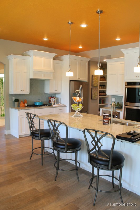
–Ceilings should always be white. Traditionally speaking, yes (perhaps with a little wall color added in for harmonious effect). Modern thinking: ceilings should be considered the “fifth wall” in a room. Anything goes. Notice the ceiling color in hip restaurants or retail spaces.
Need some help building a harmonizing palette for your walls?
Give Cathy a call to talk color today.
We’ll team up to create a color plan that fits you and your lifestyle.


