Hardwired for Color
Artist and neuroscientist Bevil Conway explores the fascinating perceptual and emotional connections between our brains and color, as described in this article by Eric Jaffe. (Co.Design website). As most artists and designers know, color choices matter, affecting mood, productivity, attention and energy. Color is relational; the same color is perceived differently when seen adjacent to other colors. (See Xs study illustrated below.) This is important to consider when choosing wall color, especially when it is ‘layered’; multiple rooms are seen from a particular vantage point and must be compatible.
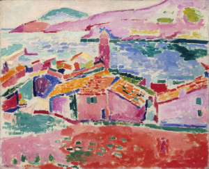
Conway believes we can learn a lot from artists (like Henri Matisse) and colorists (like Joseph Albers and Johannes Itten) who have made color and color relationships their life work, to better understand human emotional response and decision making.
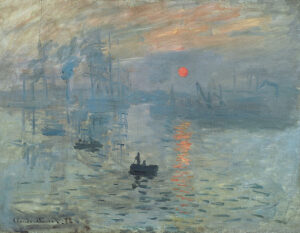
Notice the ‘breathing lines’ of white space left around patches of color in the Matisse painting above (“Les Toits des Collioure”), giving colors their own space to be seen, without fighting neighboring hues. The same principle is evident in Joseph Albers Xs; the top set of Xs look different because they are directly adjacent to a background color, even though they are the same. The lower set is more clearly perceived the same because of the white ‘breathing’ channels surrounding them. In the Monet painting below, “Sunrise, Impression”, we see the vibrant contrast of the orange rising sun, made superbly hot because of the cool colors surrounding it. The orange patches of the reflected sun in the water seem to move, interacting with the cool blue.
http://www.fastcodesign.com/3027740/evidence/the-fascinating-neuroscience-of-color
Category: Blog


