Projects

A-Frame Transformation

A-Frame Transformation

| March 1, 2022 | Reply

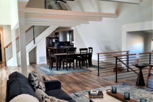
Great room under reconstruction. This dated 60s A-frame set in the Colorado front range foothills got some big 21st century love when a couple with renovation experience decided to take the plunge. The entire interior was gutted and a new addition added desired square footage and a 2 car garage. I was called in to […]

Read More

New Life for 90s Boulder Home

New Life for 90s Boulder Home

| May 24, 2016 | Reply

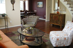
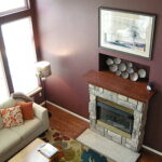
When working with new clients, I usually send them a “Client Color Questionnaire” to gauge their interests, vision and ‘color tolerance level’. I have a lot of good information before I’ve walked through their front door. These clients are an active, eclectic and fun-loving professional couple. World travelers, they have collected richly colored art and […]

Read More

Dental Office Vision Comes to Life.

Dental Office Vision Comes to Life.

| May 9, 2016 | Reply

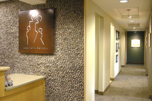
The good news: the move was an opportunity to create the warm, inviting dental office Dr. Jana Ikeda had always envisioned, from the ground up. The ‘bad’ news: time and effort taken from a busy Boulder practice. So many decisions to make, working with the architect and building contractor. But the end result was well […]

Read More

Vista Ridge Community Center – Erie, CO

Vista Ridge Community Center – Erie, CO

| April 23, 2015 | Reply

Vista Ridge Community Center, located in the Vista Ridge development in Erie, Colorado, was built in the mid 2000s. The open and spacious center, the heart of the community, houses offices, meeting spaces, a large community room, kitchen; exercise rooms, clubhouse style bathrooms with full showers, and an outdoor pool. When the busy center was […]

Read More

Color Shift- Making a House a Home

Color Shift- Making a House a Home

| April 2, 2015 | 1 Reply

Often clients will ask me to help adjust the wall color palette to reflect their taste and lifestyle as they move into a new house. ‘Hot Tomato’ works for some people in their kitchen, but this couple wanted a more ‘Zen’, quiet, sophisticated wall color design to feel at home in their new space. This […]

Read More

Color lift for vintage home.

Color lift for vintage home.

| February 3, 2014 | Reply

After living in my house for 4 years I decided it was time to do some interior painting but I was stuck on colors.  Cathy came over and made some wonderful suggestions that worked with my existing décor colors and gave me references for painters (who did a great job).  I also needed to match a color – […]

Read More

Staging – optimal presentation for resale

Staging – optimal presentation for resale

| March 26, 2013 | Reply

Staging makes the most of that valuable ‘first impression’ of prospective home buyers. We used much of the homeowner’s furnishings and accessories here to create an inviting living room that prospective buyers find appealing. Editing out clutter and creating clean, attractive spaces potential buyers can imagine themselves in is key. Please note: I no longer […]

Read More

The “fifth wall” – color on the ceiling

The “fifth wall” – color on the ceiling

| March 26, 2013 | Reply

These homeowners felt lost in the vaulted spaces of their entry, front living and dining rooms. We added warm clay accent to the dining room ceiling, pepper gray to emphasize the architectural features. In the living-entry areas, we continued the harmonizing neutral and painted the ceiling a rich, nutty brown. The effect is inviting, modern […]

Read More

Art works and wall color

Art works and wall color

| March 26, 2013 | Reply

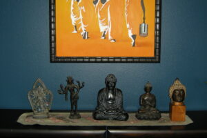
The right ‘value’  (lightness or darkness) is often as important as the ‘hue’ (color) when selecting wall color, especially when considering how to best showcase art and collections. In this case, the rich yellow-orange painting showed weakly against the background white wall. We chose a deep teal for this accent wall, paired with a soft […]

Read More

Light tan is not always “neutral” on exteriors

Light tan is not always “neutral” on exteriors

| March 26, 2013 | Reply

Exterior color is seen in the context of its surroundings. This Lyons home, perched high and visible on a hilltop, is surrounded by red rock and Ponderosa pine. When first built, a light ‘default neutral tan’ paint color was applied. Because of its light ‘value’ (light to dark scale), it contrasted too much with its […]

Read More