Color Story of the Golden Gate Bridge
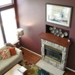
I’ve just finished working with a client, transplanted from the Bay area, who wanted to paint her kitchen the color of the beloved bridge. We chose Sherwin Williams “Roycroft Adobe” which seems to capture the warm, glowing essence of the rusty red orange. She’s delighted with it. I think it reiterates the powerful relationship between personal color experiences and color selections for living spaces.
I love that the consulting architect, Irving Morrow, understood the importance of the color in context.
‘ “The Golden Gate Bridge,” Morrow wrote, “is one of the greatest monuments of all time. Its unprecedented size and scale, along with its grace of form and independence of conception, all call for unique and unconventional treatment from every point of view. What has been thus played up in form should not be let down in color.” ‘
‘The (standard red) primer would need some added tones, but Morrow felt it was an ideal complement to the gray fog, the golden and green hills, the blue water and sky.’
See the full April 26 NPR article: http://www.npr.org/2011/04/26/135150942/the-golden-gate-bridges-accidental-color?sc=emaf
(Thanks to Jan Jessup, CMG, who posted this April 26 NPR story on the history behind the famous color of the Golden Gate Bridge.)

Category: Blog


